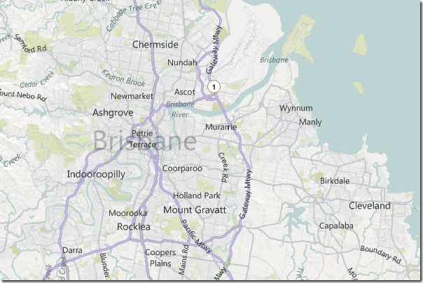
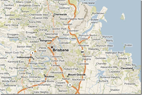
 Today Bing Maps updated their base Road style tiles, the results are amazing.
New:

Old:

The new map symbology is significantly cleaner, easier to read and more appropriate for us to rendering data over the top.
We often ran into issues where the vibrate orange roads were to dominant and if, for example, we wanted to draw the user’s attention to the route of a vehicle we had to make they visualisation louder. With the new style we can be more subtle, we can use colours that compliment the users site.
Overall Bing has made a significant investment in adding some high quality to design to all of its assets. I’m very proud that the Bing Maps team have been able to take on a significant challenge like this and deliver.
View the new style yourself and see if your location is easier to find, clearer and works better for your application:
http://www.bing.com/maps/explore/
What do you think of the new style? You can reach me on http://twitter.com/soulsolutions
