 The next control I want to touch on in the Interactions Gallery is the KinectUserView. Now that we know that our Kinect is plugged in and working, most of us want to give the user some indication of where they are in relation to the Kinect to ensure they are the correct distance and position from the Kinect for the things we want them to do. We’ve tried a few things in the past:
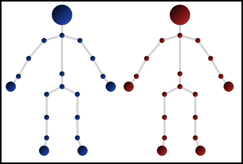
1. We made a little WPF skeleton that we’d overlay over some of our interactions. This was interesting to play with but tended to be a bit distracting.
2. Use the depth camera to give a silloute effect and give it some colour. We found this was much more useful as it resembled the user so they were more easily able to tell that the Kinect had recognised them and not the guy standing to the side etc.
I’ve seen various incarnations of this by other people also, so it’s good to see we now have a standard control that we all don’t have to write from scratch. To add this control we continue on from where we left off with the KinectRegion.
XAML:
Add the UserViewer Control and bind it to our Kinect Region:
<k:KinectUserViewer k:KinectRegion.KinectRegion="{Binding ElementName=KinectRegion}" />
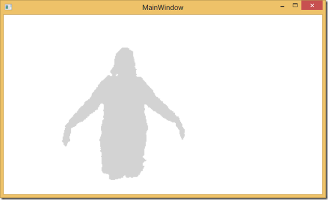
Run the project and we can see ourselves:
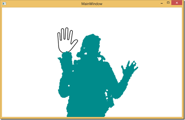
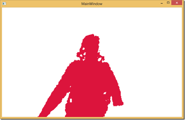
Don’t like the colours for the user..then we can change these really easily with DefaultUserColor or PrimaryUserColor:
<k:KinectUserViewer k:KinectRegion.KinectRegion="{Binding ElementName=KinectRegion}" PrimaryUserColor="DarkCyan" DefaultUserColor="Crimson"/>
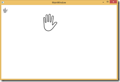
Now taking up the whole screen could be good to start but probably will get in our road fairly quickly. So we’ll just move the control up out of the way in top right in the XAML
<k:KinectUserViewer k:KinectRegion.KinectRegion="{Binding ElementName=KinectRegion}" VerticalAlignment="Top" HorizontalAlignment="Left" Height="50"/>
Now when we run, we get an idea where we are, and it doesn’t get in our way for other things.

