 The next controls I want to touch on in the Interactions Gallery are the KinectTileButton and KinectCircleButton. Now we have our KinectRegion and can see what we’re doing with the UserView control, we can start interacting.
In its simplest form, the KinectTileButton still has a lot of visual features. Simply add it to your XAML and run:
        <k:KinectRegion Name="KinectRegion">
            <k:KinectTileButton />
        </k:KinectRegion>
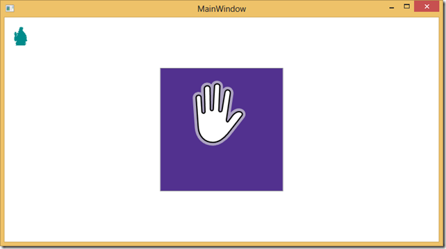
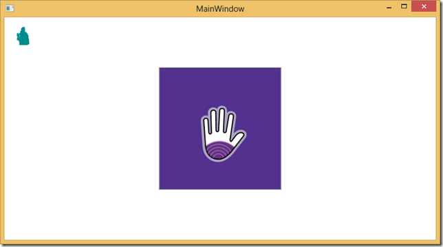
In its default form it’s a giant purple button that you can easily put your hand cursor over. With the interactions the team has added the ability to detect a “push” gesture from either hand. As I start to press in with my hand the cursor changes to indicate that I’m pressing
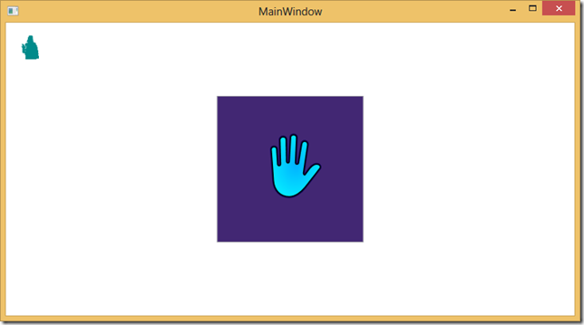
The cursor becomes more full of purple lines until I’ve pushed in to trigger a button click and then it changes colour completely.
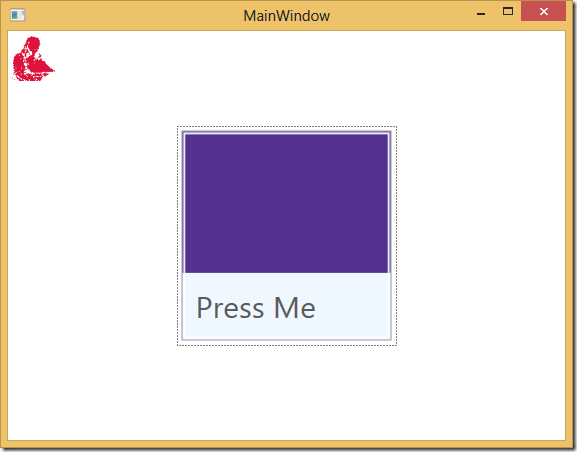
We can do other normal button things like set the title and the background of the button:
<k:KinectTileButton HorizontalLabelAlignment="Left" Label="Press Me" LabelBackground="AliceBlue"/>
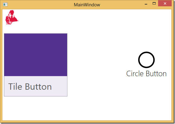
The KinectCircleButton is almost identical, except it provides a circular button rather than the boxy metro type.
        <k:KinectRegion Name="KinectRegion">
            <Grid>
                <k:KinectTileButton HorizontalLabelAlignment="Left" Label="Tile Button" HorizontalAlignment="Left" VerticalAlignment="Center"/>
                <k:KinectCircleButton HorizontalAlignment="Right" VerticalAlignment="Center" Label="Circle Button"></k:KinectCircleButton>
            </Grid>
        </k:KinectRegion>

